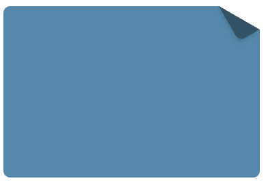
右上角带有一个折叠三角形效果的框框,可以用如下css方式实现:
div {position: relative;width: 300px;height: 200px;background: #58a; /* 回退样式 */background: linear-gradient(-150deg, transparent 1.5em, #58a 0);border-radius: 0.5em;}div::before {content: “”;position: absolute;top: 0;right: 0;background: linear-gradient(to left bottom,transparent 50%,rgba(0, 0, 0, 0.4) 0);width: 1.73em;height: 3em;transform-origin: bottom right;transform: translateY(-1.3em) rotate(-30deg);border-bottom-left-radius: inherit;box-shadow: -0.2em 0.2em 0.3em -0.1em rgba(0, 0, 0, 0.15);}