我们知道,CSS 动画及过渡提供了一个 delay 属性,可以延迟动画的进行。
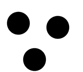
考虑下面这个动画:
简单的代码大概是这样:
HTML:
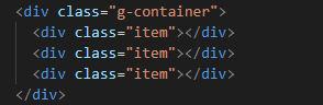
CSS:
.g-container {
margin: 200px;
width: 100px;
height: 100px;
position: relative;
}
.item {
position: absolute;
left: 0;
top: 0;
width: 50px;
height: 50px;
border-radius: 100%;
background: black;
transform: rotate(0) translate(-80px, 0);
}
.item:nth-child(1) {
animation: rotate 3s infinite linear;
}
.item:nth-child(2) {
animation: rotate 3s infinite 1s linear;
}
.item:nth-child(3) {
animation: rotate 3s infinite 2s linear;
}
@keyframes rotate {
100% {
transform: rotate(360deg) translate(-80px, 0);
}
}
如果,我们想去掉这个延迟,希望在一进入页面的时候,3 个球就是同时运动的。这个时候,只需要把正向的 animation-delay 改成负向的即可。
.item:nth-child(1) {
animation: rotate 3s infinite linear;
}
.item:nth-child(2) {
animation: rotate 3s infinite -1s linear;
}
.item:nth-child(3) {
animation: rotate 3s infinite -2s linear;
}
这里,有个小技巧,被设置了 animation-dealy 为负值的动画会立刻执行,开始的位置是其动画阶段中的一个阶段。所以,动画在一开始的时刻就是这样。以上述动画为例,一个被定义执行 3s 的动画,如果 animation-delay 为 -1s,起点相当于正常执行时,第2s(3-1)时的位置。